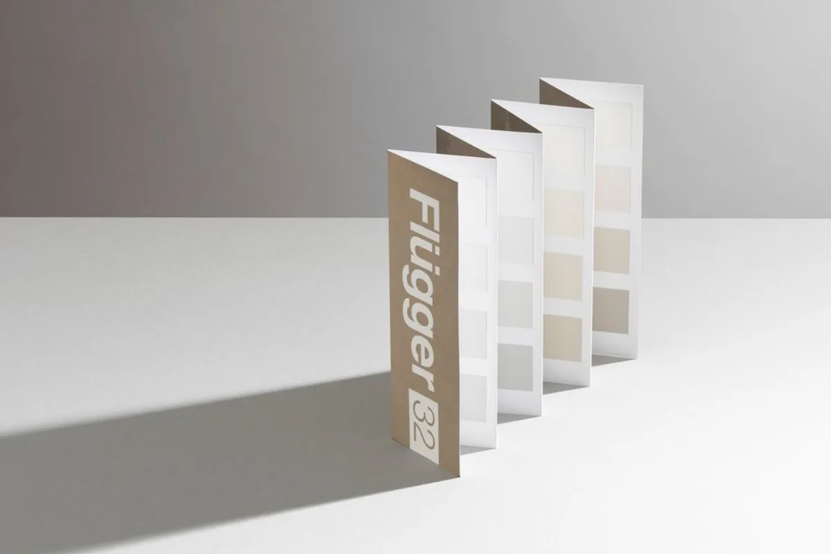
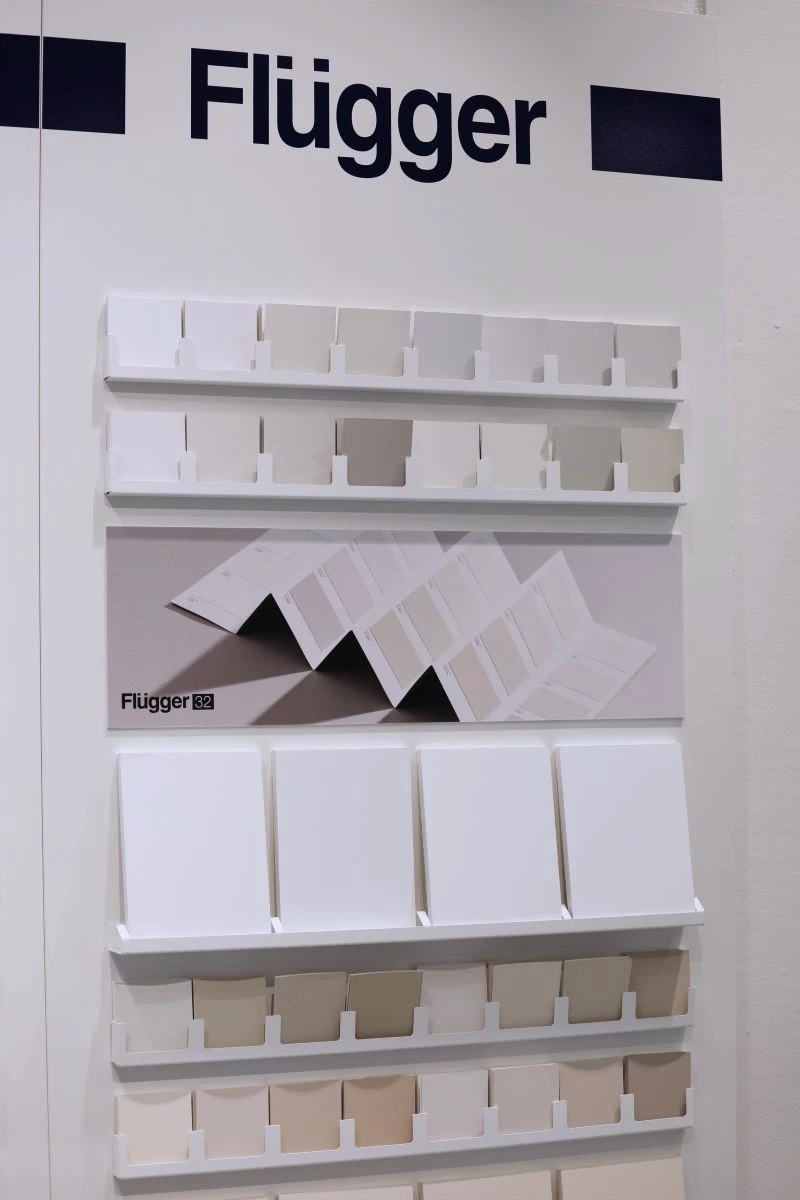
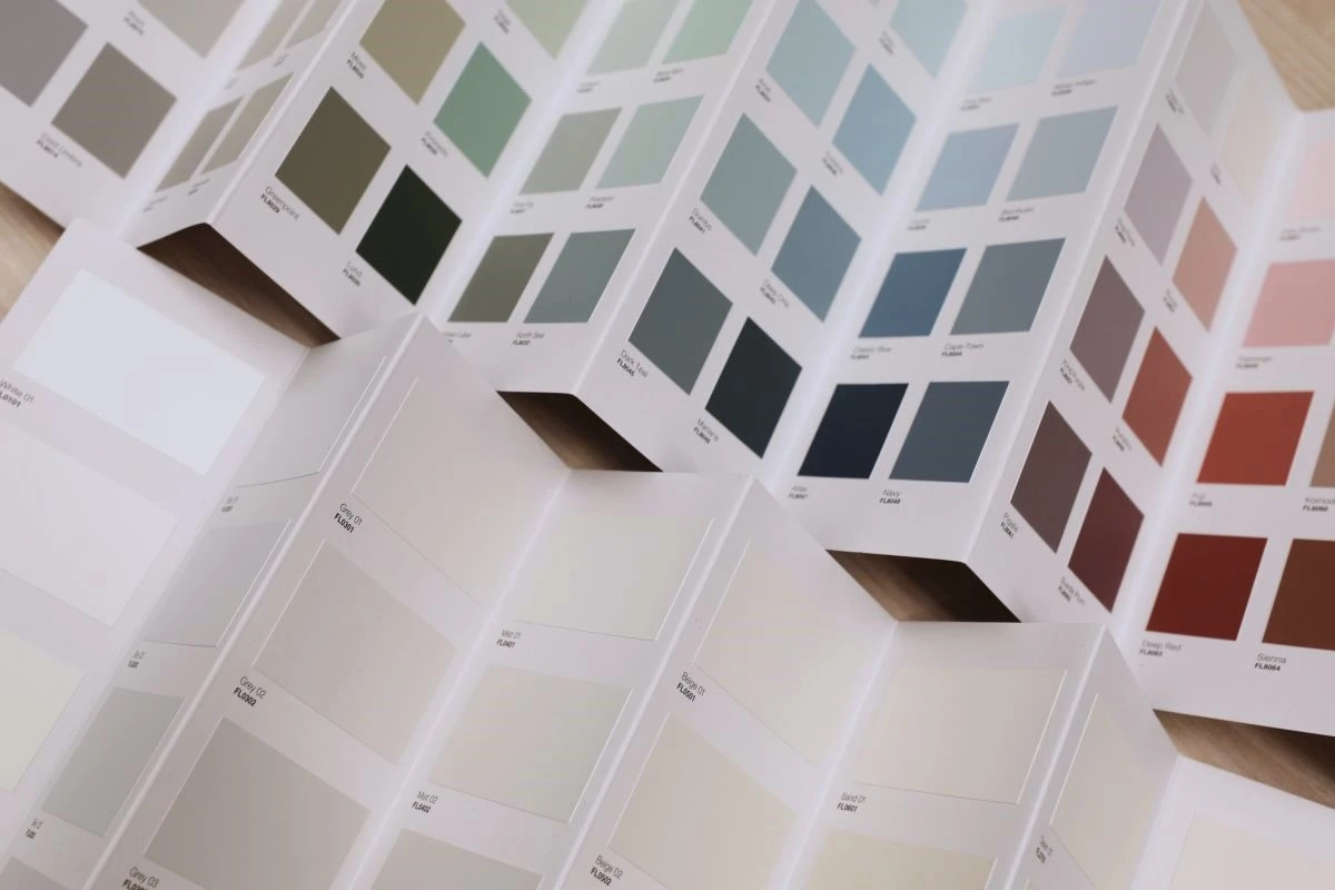
The new colour card features 32 carefully selected shades; from classic cool tones to warmer, golden tones. These nuances align with today’s interior trends, where natural materials, beige and earthy browns are becoming more prevalent.
“Internally at Flügger, we’ve affectionately called it ‘the dull colour card’. Simply because it doesn’t feature a wide range of bold, eye-catching colours. But in this case, dull is the highest compliment. I’m proud that we’ve created a thoughtful, timeless and aesthetically pleasing colour card, fully focused on our customers’ needs,” says Charlotte Ottesen-Hansen, SVP for Brand & Business Development at Flügger. She adds:
“We have high expectations that customers will embrace this new card. Our humble ambition is that these shades will become the best-selling and most popular in our range.”
White is never just white
If you take a closer look at white shades, you’ll quickly discover they are anything but simple. For years, white was considered a safe and neutral choice – yet in practice, it’s one of the most complex colours to work with. Lighting, interior décor and materials can all influence how a shade of white is perceived. For example, cool whites can look bluish in the wrong light, while pure whites can feel stark or clinical when paired with warm materials like wood or natural textiles:
“The Danes want shades of white that adapt to the materials, lighting and style of their homes. That’s why we’ve developed a complete colour card that makes it easier to choose the right shade,”
explains Charlotte Ottesen-Hansen.
Meeting customer demand
The launch of Flügger 32 is a direct response to growing demand from both private customers and professional painters.
“When we speak with customers and painters, we hear it time and again: they’ve been missing a comprehensive and well-considered selection of white and neutral tones. With Flügger 32, we’re offering a colour card that makes it easier to choose a shade that suits the individual home. Whether you want a cool, warm or soft expression,”
says Charlotte Ottesen-Hansen.
Inspired by Nordic nature
The shades in Flügger 32 are inspired by the raw, beautiful nature of the Nordics, from snow and stone to open coastlines. They bring the same calm, harmonious atmosphere into the home. Each shade has been developed in Flügger’s lab just outside Copenhagen. The in-house design team and colour specialists have worked together closely to create the colour card.
The colour card is based on customer and store feedback, current interior trends and classic Scandinavian palettes. These neutral tones work beautifully on both indoor and outdoor surfaces, creating a consistent look with a sensory depth.